← All work
WebsiteBookingUX and UI design

PodBooker

PodBooker, Beirut's podcast studio, redesigned: a bold, on-air website where hosts find their room, compare packages and book a session in a few clear steps.

Role
UX and UI design
Type
Booking website
Year
2025
Tools
Figma
The challenge

Booking studio time means comparing rooms, packages and extras, often over messages. Podcasters needed to see the studios and book without the back-and-forth.

What I did

Redesigned the website and the booking flow: the home and studio pages, pricing and bundles, and a step-by-step booking with a live summary of the session.

The result

A site that feels like the studio looks: the rooms up front, prices in plain view, and a booking that's done in five short steps.

Fig 1PodBooker
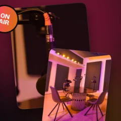
PodBooker's studio page

on air

Rooms for every story

The home page leads with the rooms, Audio & Video Pro, Audio, and Audio & Video, each a large photo card, so hosts can picture their show before they read a word.

podbooker · rooms for every story
The studio rooms on the home page

Member benefits

Flexibility, quality and convenience, told through photos of real sessions rather than icons.

podbooker · member benefits
The member benefits

Simple pricing

Three packages per episode, from audio only to the full production, with what's included ticked off and the most popular one lit up in the brand's gradient.

podbooker · simple pricing
Pricing per episode
MassaPricing per episode matches how podcasters already think about their budget.

Bundles

Monthly bundles show the saving at a glance, so regular hosts can commit to a season instead of booking one session at a time.

podbooker · bundles
The monthly bundles

Pick your studio

Booking is five short steps: service, setup, time slot, extras and payment. Choosing the studio comes with photos of each room and a summary that updates as you go.

podbooker · pick your studio
Booking: picking the studio

Level up your episode

Extras like production edits, short clips, thumbnails and show notes are added with a tap, each with its price, while the total updates in the summary.

podbooker · level up your episode
Booking: adding extras
MassaThe live summary means there are no surprises at the payment step.

Hosts who found their sound

Testimonials from hosts, with a warm gradient card drawing the eye to the first one.

podbooker · hosts who found their sound
Testimonials from hosts

Find the studio

A map, the address and directions close the page, because the last question before booking is always 'where is it?'.

podbooker · find the studio
The studio on the map

Key decisions

A studio sells a feeling before it sells a slot.

  1. Sound you can seeCrimson-to-orange gradients, an 'on air' sign and a scrolling 'record, edit, publish' strip set the mood before anything is read.
  2. Booking in stepsFive short steps with a progress bar and a live summary replace one long form.
  3. Prices in plain viewPer-episode prices, bundles and extras are always shown in full, with nothing hidden until checkout.

The outcome

A full redesign of the PodBooker website and its booking: home, studio, pricing and bundles, and a step-by-step flow, in a bold dark system that feels like being on air.

People book what they can picture. Show the room first, then make the booking feel effortless.

Massa, on PodBooker

More work

  1. WhiteSet

    A casting platform that takes talent from discovery to booking: one place for performers to be seen and for casting teams to find them.

  2. Carro

    A car marketplace that brings buying and financing together: configure a new car, compare offers and apply for a bank loan in one place.

  3. Allgram

    A secure, decentralized space for communication and community: chat, calls, a digital ID and an enterprise platform, presented as one ecosystem.