← All work
WebsiteCommunication appUX and UI design

Allgram

Allgram, a secure, decentralized space for communication and community: chat, calls, a digital ID and an enterprise platform, presented as one ecosystem.

Role
UX and UI design
Type
Product website
Year
2025
Tools
Figma
The challenge

Allgram does a lot: encrypted messaging, a verified digital ID, a marketplace and a self-hosted enterprise offer. The site had to explain all of it without overwhelming anyone.

What I did

Designed the product website: the home page, the consumer app page, the enterprise solutions page and the ecosystem overview, in a deep-blue, glowing visual system.

The result

A site that leads with one clear promise, then lets people and organisations each go deeper into what matters to them.

Fig 1Allgram
Allgram's consumer app page

one app, the whole ecosystem

Why Allgram

Six features in a calm grid, each with an icon and a line, so the breadth of the product reads as a list of benefits rather than a wall of technology.

allgram · why allgram
Why Allgram, in six features

Fast, secure, all in one

A bento grid pairs the headline promise with the pillars behind it: the digital ID, content monetization, enterprise-grade security and a universal communication hub.

allgram · fast, secure, all in one
The bento grid of Allgram's pillars

The digital ID

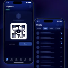
The consumer page shows the app itself: a carousel of real screens with the Digital ID in focus, a secure QR code that proves who you are.

allgram · the digital id
The app screens, with the Digital ID in focus
MassaShowing the real screens did more than any feature list.

Professional solutions

Licensed services, chat systems, video calls, analytics, APIs and white-label, as a bento of cards with 3D icons, each one a door into the detail.

allgram · professional solutions
Professional solutions as a bento of cards

Built for enterprise

The enterprise page opens with the numbers organisations ask about first, uptime, encryption, users and support, then nine reasons to choose Allgram.

allgram · built for enterprise
The enterprise page

Deployment options

Self-hosted, managed cloud, hybrid or white-label, each in its own tab with its highlights and an illustration, so IT teams can compare at their own pace.

allgram · deployment options
The deployment options

Side by side

A full comparison table sets the four ways to deploy against each other, from data sovereignty to time to deploy, with clear colour-coded values.

allgram · side by side
The deployment comparison table

Get the app

Desktop, mobile and web, each with its own download, so every page ends on a clear next step.

allgram · get the app
Downloading Allgram

Key decisions

A product this broad needed a clear order.

  1. One promise firstEvery page leads with a single sentence about security and community, before any feature.
  2. Two audiences, two pathsPeople and organisations each get their own page, language and proof.
  3. Glow with restraintDeep blues, soft glows and 3D icons give the brand its tech feel, while the text stays high-contrast and easy to read.

The outcome

A complete product website across four pages, on a dark, luminous system that makes a technically complex product feel approachable.

When a product does everything, the design's job is to decide what comes first.

Massa, on Allgram

More work

  1. WhiteSet

    A casting platform that takes talent from discovery to booking: one place for performers to be seen and for casting teams to find them.

  2. Carro

    A car marketplace that brings buying and financing together: configure a new car, compare offers and apply for a bank loan in one place.

  3. Proradius

    A dashboard for internet service providers that keeps subscribers, services, network and billing in one place: smooth internet management and happy users.