← All work
WebsiteEditorialUI design

Verse

Verse, a blog website where the stories lead: bold imagery, a quiet interface, and reading that comes first.

Role
UI design
Type
Blog website
Year
2024
Tools
Figma
The challenge

Blogs often bury their writing under menus, banners and widgets. Verse needed the stories to come first.

What I did

Designed the blog's interface: the landing view, the article cards and the reading layout.

The result

A blog that feels like a magazine: bold imagery up front, a quiet interface, and reading that comes first.

Fig 1Verse
Verse, presentation shot

the stories lead

The cover

The landing view fans out featured articles like magazine covers, so the first thing you meet is the writing.

verse · the cover
The Verse landing view

Key decisions

Every choice served one goal: get people reading.

  1. Covers, not cardsFeatured articles fan out like magazine covers, so the first thing you meet is the writing.
  2. A quiet interfaceNavigation and controls step back, leaving the room to images and headlines.
  3. Set for long readsType and spacing are chosen so articles stay comfortable to the very end.

The outcome

A complete blog design where imagery and typography carry the brand, and the interface stays out of the way of the stories.

The best blog interface is the one you stop noticing after the first paragraph.

Massa, on Verse

More work

  1. TicketEasy

    A mobile app that simplifies the online booking process for event and movie tickets.

  2. Proradius

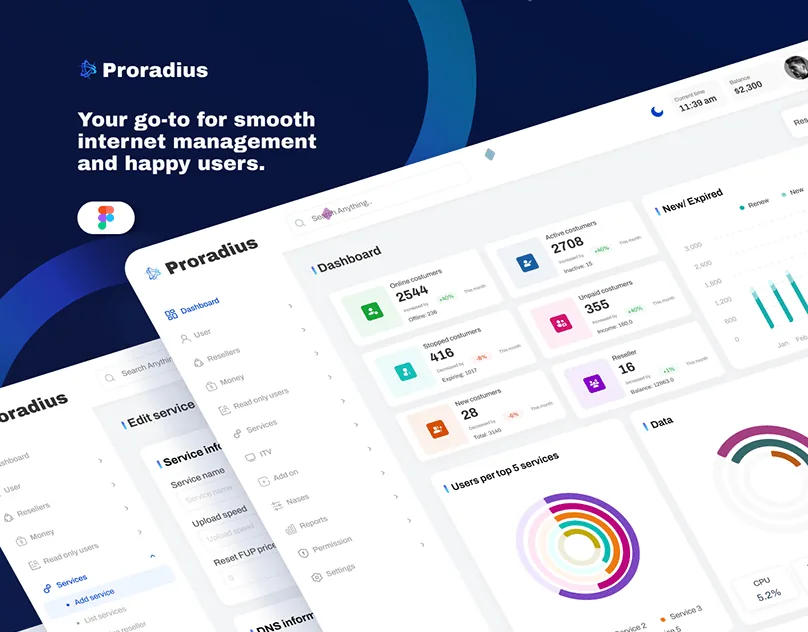
    A dashboard for internet service providers that keeps subscribers, services, network and billing in one place: smooth internet management and happy users.

  3. Elevation

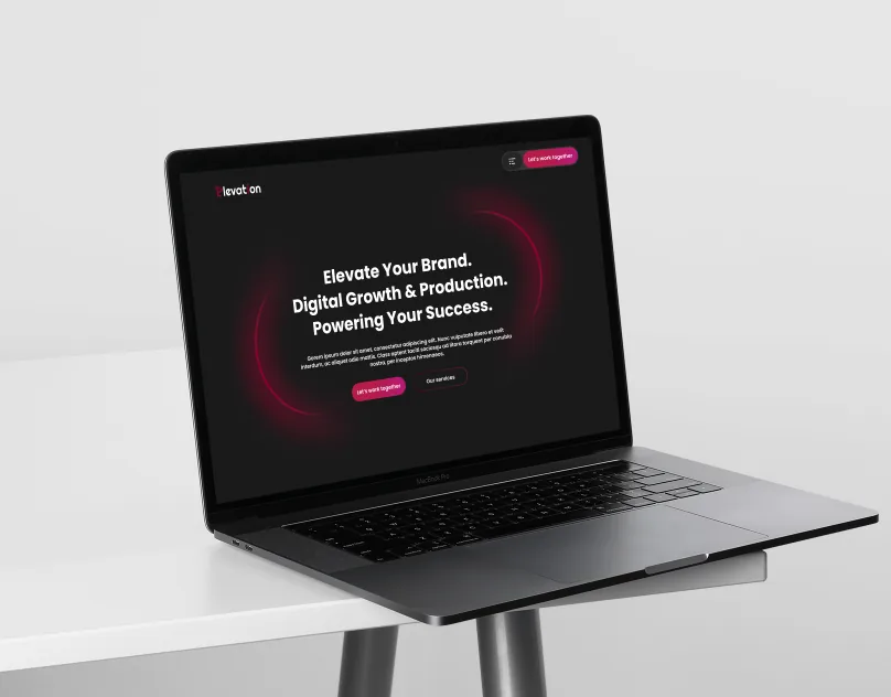
    A website for a digital marketing and production agency: elevate your brand, digital growth and production, powering your success.